Radar Chart Maker
Skip the long setup — build a radar chart in seconds with Edubrain!
See How Your Chart Takes Shape
Create your diagrams in no time with EduBrain. Ready for you at any time, anywhere!

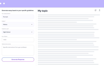
Prepare your chart data
Spider chart maker reads your data best when one column contains names and the rest hold numbers — at least three — that make sense together, like percentages or rating scores.
Create a radar chart
The diagram builds from your words, so write a clear prompt with real data and list the features that matter. After everything looks right, click "Create diagram" to bring it to life.
Final check
Before sharing, go through each axis and value so the web chart shows true data.
Featured in

Who It’s For
Anyone who works with data across categories can use Edubrain radar chart maker. It reads numbers fast and forms a shape that makes patterns stand out.
- Students gain a quick way to display scores or research outcomes in one clear spider chart.
- Researchers find a tool that turns raw data values into balanced visual patterns.
- Managers compare performance metrics across teams and spot weak points instantly.
- Educators present student progress across categories and make reports easier to read.
- Marketers discover brand strengths or product gaps at one glance.
- Consultants and HR teams reveal skill balance or team growth with real clarity.
Edubrain diagram generator turns every data source into a visual story and helps you interpret results faster!
Choose your plan
Cancel anytime. We'll email you 2 days before your subscription renews.
Free plan
$0 /week
Key Features:
- Unlimited use with ads included
- Free access to all AI tools
- Download all responses (answers, presentations, flashcards, etc.)
- Share responses with others
Most popular
AI-Plus
$3.99 /week
Key Features:
- Expert reviews on discounted prices
- Ad-free experience to:
- AI detector
- Diagram generator
- PowerPoint generator
- Answer generator
- Flashcard maker
- Notes generator
- Research assistant
- Download all responses (answers, presentations, flashcards, etc.)
- Share responses with others
- Advanced reasoning
Expert help
from $3.99
Choose a service:
- Presentations (human-made)
- Homework help
- STEM support
- Writing assistance
- Editing & proofreading
4.89 Trusted by 229,863 students/mo
See More AI Tools

AI Diagram Generator

AI Flowchart Generator

AI Mindmap Generator

AI Pie Chart Generator

AI Timeline Generator

Sequence Diagram Generator
Frequently Asked Questions
How can I make complex data easy to see?
When the data feels too heavy, the radar chart maker takes over. It separates multiple variables around equal axes and tags them with data labels that stay visible. The chart appears in seconds, ready for class or presentation.
Does this take less time than Excel?
Yes, it saves real time during reports. The chart forms within seconds and handles complex comparisons easily. Excel can sort and calculate, but formatting slows every step. This radar chart maker displays data from different categories in one clean layout. The time gap feels huge once you try both.
What if I have no design skills?
That’s fine. The visualization part happens automatically, and every polar chart keeps a balanced shape without extra effort.
Can I fix wrong values?
Replace the incorrect figures, recreate the visual, and the updated chart shows the right data immediately.
Can I export the chart for my report?
Just save the chart as an image and paste it right into your project. You can share a link too if your teacher prefers a live view. The picture keeps the same colors and layout.
Can my team see the same chart?
The radar chart maker keeps all data synced through a shared link. Once sent, your teammates open the exact chart you built.
How accurate are the charts?
The chart comes straight from your data, not from presets. Each line reflects real numbers across different variables. Nothing shifts or rounds off in the process. What you see matches the dataset exactly.
Is my data safe?
EduBrain never stores or shares your files. All charts stay private during use.
Do I need to pay for exports?
You don’t pay for that. The plan only tracks how many times you create a chart. Exports cost nothing, no matter the format. Save, share, or print as much as you want. Everything stays open once the chart appears.
Can I use it for any course?
Yes, you can use it for almost any course. The radar chart maker works great for math, biology, psychology, or even business projects. It reads your data and turns it into clean visuals for reports or slides. If you need extra help, EduBrain homework helper also offers AI tools for sociology and a social studies AI solver for those subjects.
Does it adapt to research in both technical and non-technical fields?
Our tool handles any discipline — a data-heavy anatomy AI report, a lab summary for microbiology homework, or a survey in political science. It adapts to your data form without confusion. Every axis finds the right place. You focus on insight instead of layout.
0%
Preparing a solution…
